This is an exciting time for my business, Shearer’s Girl Yarns, as I am starting to plan for the summer’s events. When you are a one person band you really do have to take on so many roles. I’m a spinner, a dyer, a sheep shearer, a wool winder, a book keeper, a salesperson, a copywriter, a web designer (maybe not!), a one person marketing department and now a designer of adverts. I’m sure I’ve missed several dozen other jobs I do but that’s my initial list.
This year I want to think seriously about advertising. Today I am battling with fonts, colours and trying to fit my logo, web address and a few words which sum up my business into a small space. I thought I’d take a break before I tug out my last remaining strands of hair and tell you the story behind the company logo.
Here is the logo:
My logo was a joint enterprise (can’t you go to prison for that?) between myself and a friend with design experience and the right computer packages. I wanted colours which reflected the countryside, greens, golds, maybe oranges, tweedy colours. I wanted a font which would have a traditional feel, my business is rooted in crafts which go back centuries: sheep shearing, spinning, dyeing. I wanted an image which would remind people of where the lovely yarns we knit with come from.
I am very much concerned with keeping the links alive between raising and shearing sheep and the crafts of working with wool. I didn’t want a carton sheep as my logo, I wanted something real. Something which reflected the hard work that goes into wool production. Luxurious yarns start with the dirt and sweat of manually shearing a sheep, hence the strapline ‘down to earth luxury’.
At this point in time, no one has succeeded in designing a machine which shears sheep without human labour. There have been unsuccessful experiments going on for years but that it another story. I am not a professional shearer but I do shear some sheep each year and I know from firsthand experience how difficult the job is. The aim was to design a logo which reminds us of where wool comes from and celebrates the effort and energy which goes into harvesting fleece.
At this point in time, no one has succeeded in designing a machine which shears sheep without human labour. There have been unsuccessful experiments going on for years but that it another story. I am not a professional shearer but I do shear some sheep each year and I know from firsthand experience how difficult the job is. The aim was to design a logo which reminds us of where wool comes from and celebrates the effort and energy which goes into harvesting fleece.
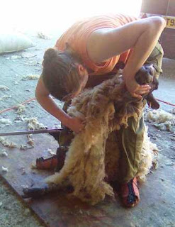
The image is based on a photo. Sadly, when I first started shearing I didn’t get any good photos, I only have a few grainy camera phone pictures:
I love this image because the angle of arms and elbows give the impression of movement and physical effort. Also the fleece is cascading down from my hands.
What do you think of the logo? What does the logo suggest to you?


Coming up with a unified logo and statement and all of the other advertising pics that a business requires takes a lot of thought and effort.
ReplyDeleteTotally understand.
I have always liked your logo. catchy without being too busy.
Thanks Kathy, it's good to get some feedback.
ReplyDelete